

Responsive Website Design is a crucial element of creating a positive user experience. It enables websites to provide an optimal viewing experience regardless of the device used by visitors. With the increasing number of users accessing websites on mobile devices, Responsive Website Design has become essential to ensure all users have a great experience. In this blog post, we\’ll explore the importance of Responsive Design in enhancing user experience on all devices.
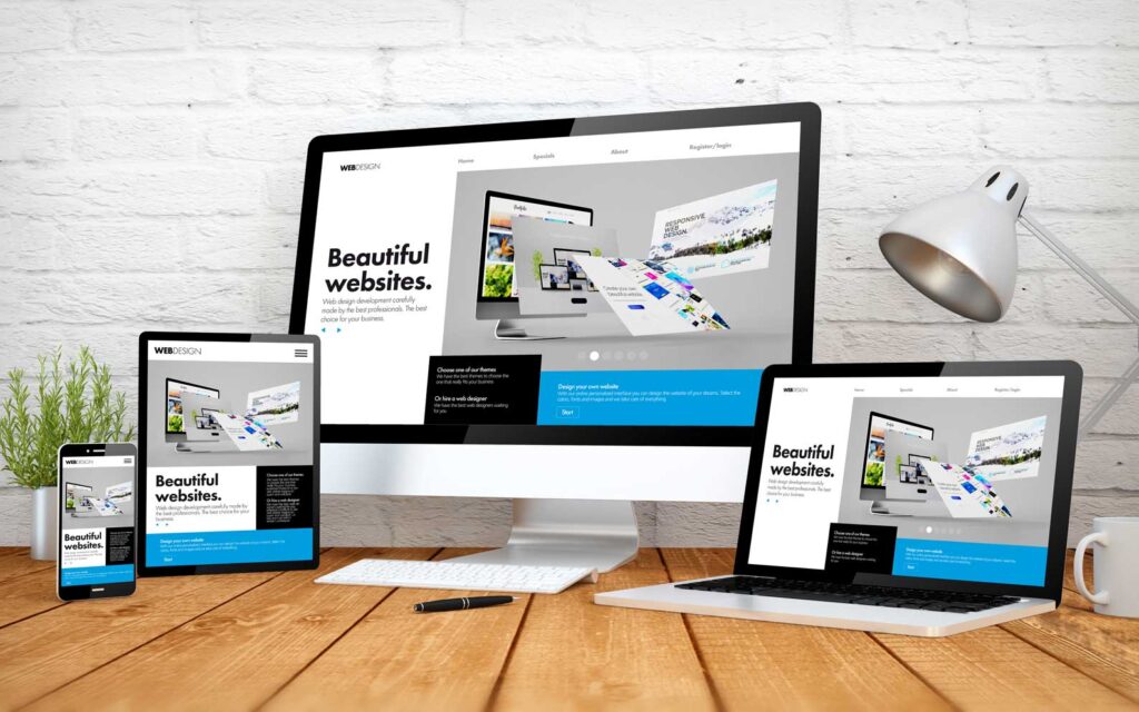
Understanding Responsive Website Design
Responsive Website Design is a fundamental concept in the world of web development. It refers to the practice of designing and coding websites in a way that ensures optimal functionality and appearance on all devices, including desktop computers, tablets, and mobile phones. In the past, websites were primarily designed for desktop users.
Why Responsive Website Design is Important for User Experience
Responsive Website Design is important for user experience because it ensures that websites are accessible and easy to use on all devices. With the growing number of users accessing websites on mobile devices, it is crucial to provide a seamless experience across different screen sizes and resolutions. One of the key reasons why Responsive Website Design is important for user experience is that it eliminates the need for separate mobile and desktop versions of a website. Instead, a single website can adapt and respond to the user\’s device, providing a consistent and optimized experience. This saves time and resources for businesses, as they only need to maintain and update one website.
Responsive Website Design also improves user experience by enhancing website loading speed. Mobile users expect fast-loading websites, and by optimizing content delivery for different devices, responsive design ensures that users can access and navigate a website quickly and efficiently. Additionally, Responsive Website Design improves user engagement and conversion rates. When a website is easy to use and navigate on any device, users are more likely to stay on the site, explore its content, and take desired actions, such as making a purchase or submitting a contact form.
Benefits of Implementing a Responsive Design
1. Increased Mobile Traffic:
With the widespread use of smartphones and tablets, more and more users are accessing websites on mobile devices. By implementing a responsive website design, businesses can ensure that their website is accessible and user-friendly on all devices. This results in increased mobile traffic, as users are more likely to stay on a website that offers a seamless experience.
2. Improved SEO:
Search engine optimization is crucial for increasing website visibility and attracting organic traffic. Responsive website design plays a significant role in improving SEO efforts. Search engines like Google prioritize mobile-friendly websites in their rankings. By implementing a responsive design, businesses can improve their website\’s visibility and achieve higher search engine rankings.
3. Consistent User Experience:
One of the primary goals of responsive website design is to provide a consistent user experience across all devices. Whether a user is accessing the website on a desktop computer, tablet, or smartphone, they should be able to navigate and interact with the website effortlessly. Consistency in user experience enhances user satisfaction and encourages repeat visits.
4. Time and Cost-Efficient:
Maintaining separate mobile and desktop versions of a website can be time-consuming and expensive. Responsive website design eliminates the need for separate versions by automatically adapting to different screen sizes and resolutions. This saves businesses time and resources, as they only need to maintain and update one website.
5. Increased Conversion Rates:
User experience plays a vital role in influencing user engagement and conversion rates. A responsive website design ensures that users can easily access and navigate a website on any device, leading to increased user satisfaction. When users have a positive experience, they are more likely to stay on the site, explore its content, and take desired actions, such as making a purchase or submitting a contact form.
Tips for Designing a Responsive Sesign that Enhances User Experience
Designing a responsive website that enhances user experience on all devices requires careful consideration and implementation of various elements. Here are some tips to help you create a website that is Responsive Design that will provide a seamless and optimized experience for users:
1. Prioritize Mobile-Friendly Design:
With the increasing number of mobile users, it\’s crucial to prioritize the mobile experience when designing a responsive website. Ensure that the website layout and elements are optimized for smaller screens and touch interaction. Use mobile-first design principles, which involve designing for mobile devices first and then scaling up for larger screens.
2. Use Responsive Grids and Flexbox:
Utilize responsive grids and flexbox layouts to create a flexible and adaptive design that adjusts to different screen sizes. This will help maintain the structure and readability of the website across various devices.
3. Optimize Images and Media:
Images and media files can significantly impact the loading speed of a website, especially on mobile devices. Optimize images by compressing them without compromising quality and use media queries to serve different image sizes based on the device. This ensures faster load times and a better user experience.
4. Simplify Navigation:
Navigation menus can be challenging to navigate on smaller screens. Simplify your website\’s navigation by using a hamburger menu or accordion-style menus that can expand or collapse as needed. This will make it easier for users to navigate your website on mobile devices.
5. Use Clear and Readable Typography:
Responsive typography is essential to ensure that text is legible on all devices. Choose fonts that are easily readable, adjust font sizes for different screen sizes, and consider line spacing and line length to improve readability.
6. Conduct User Testing:
To truly understand the user experience of your responsive website design, conduct user testing on different devices. Gather feedback from users to identify any usability issues or areas that need improvement. This will help you make necessary adjustments and refine the design for optimal user experience.
7. Regularly Test and Update:
Responsive website is an ongoing process. Regularly test your website on different devices and screen sizes to ensure that it continues to provide a seamless and optimized experience. Keep up with technological advancements and update your design accordingly to stay ahead of the curve.
By following these tips, you can create a responsive website that enhances user experience on all devices. Remember to prioritize mobile-friendly design, optimize images and media, simplify navigation, use clear typography, conduct user testing, and regularly update your design to ensure the best user experience possible.
Conclusion Responsive Website Design
In conclusion, Responsive Website Design is an essential component of modern web development that enhances user experience on all devices. With the increasing number of users accessing websites on mobile devices, it is crucial to ensure that websites are responsive and adapt to different screen sizes and resolutions. By implementing Responsive Design, businesses can provide a seamless and optimized experience for their users, regardless of the device they are using.